
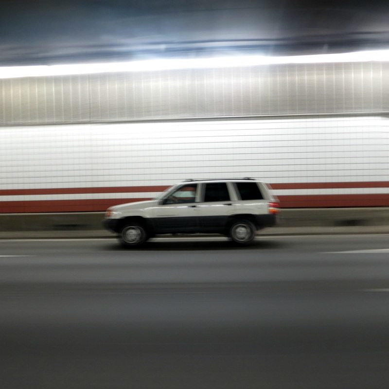
___________________________________________________________________
Assignment 1 : Line & Shape
)))))))))))))))))))))))
|
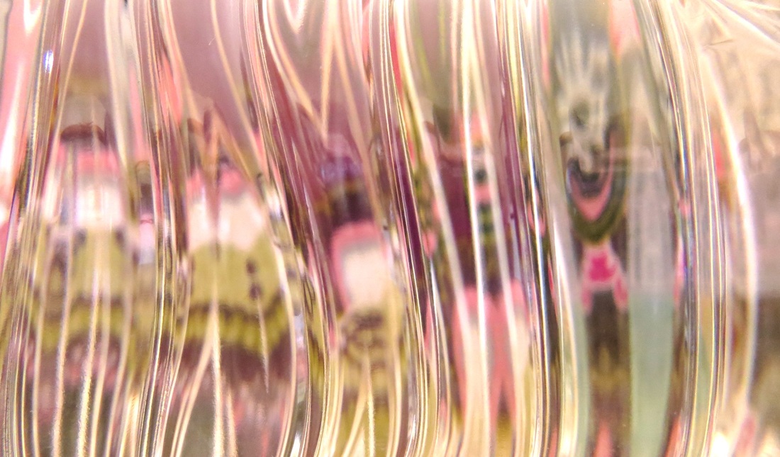
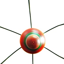
All of the photos above were taken by myself with my own camera outside of school.
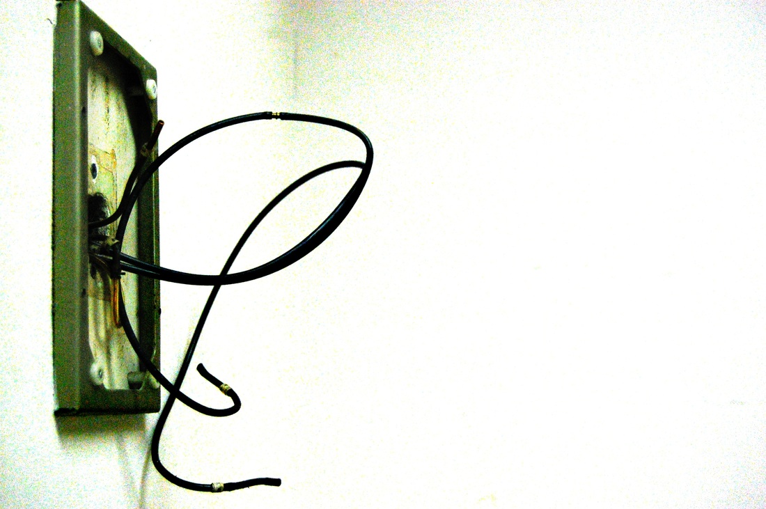
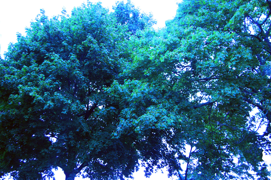
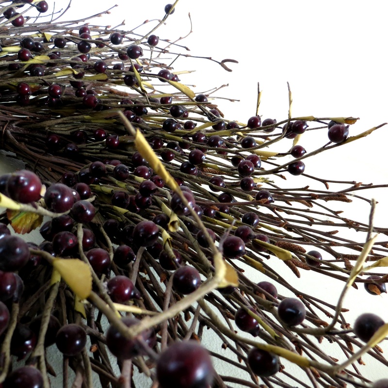
To the right is my favorite out of them all. It's a picture of my dining room chandelier taken from underneath looking up at the ceiling. It's pretty cool because you'd never think that a chandelier could make for an interesting photo but when you mess around with the angles it ends up being a great example of line & shape. The areas in between the legs of the chandelier are white and create negative space, while the actual chandelier itself makes a circle. The legs also help divide up the negative space, creating triangular type shapes. |
|
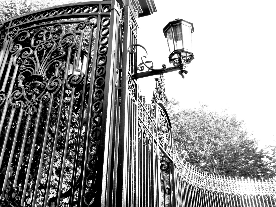
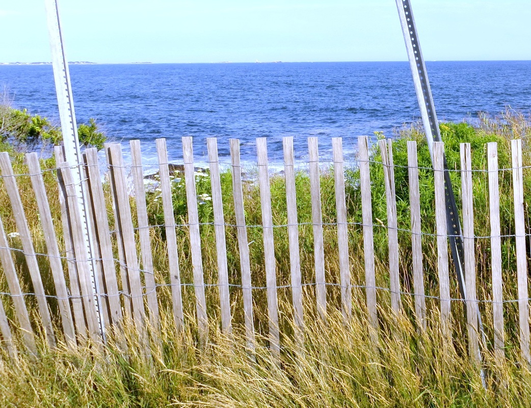
___________________________________________________________________

))))

|
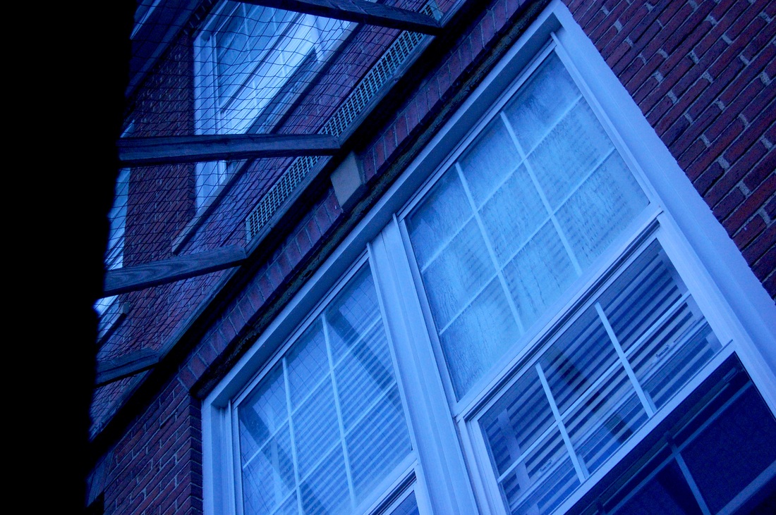
All of the photos above were taken by myself in school with the camera
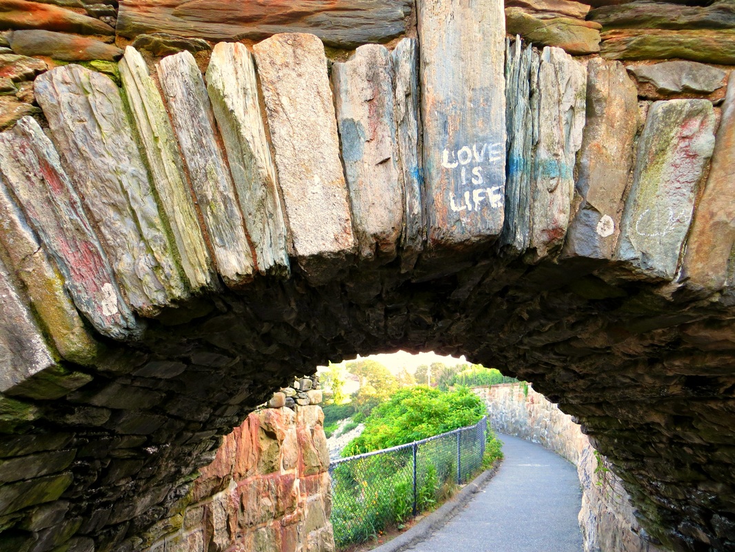
that was provided. To the left is my favorite out of the pictures that I took. The picture was taken through a window in the art gallery looking into a small outdoor space between the building walls. The angle gives a very triangular, crooked point of view to the photo. Your eye travels from the bottom left, up the black line (which is actually just the piece connecting the window screens to the wall), then down the right side of the window to the bottom again. Also, theres multiple lines throughout the photo. On the windows there are criss crossing lines and horizontal blinds. The bricks on the wall are horizontal, patterned lines. The window screens at the top left also have lines that criss cross. |
___________________________________________________________________
Assignment 2 : Pattern & Texture
|
All of the photos were taken by myself outside of school with my own camera.
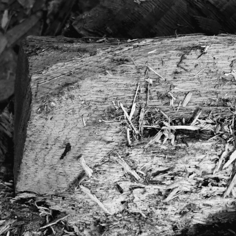
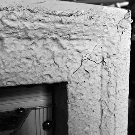
The photo to the right was my favorite out of all of the photos I took. It is a photo of an old dresser that I found outside in my garage. It was very worn down and eroding and I thought the plaster and the cracks would make an interesting shot. It shows a great amount of texture from the cracks in the corner, the rust on the nails & metal in the bottom left, and the bumps in the plaster. It also shows some rhythm, because the different textures all move in directions going towards the top right corner. As far as the edit goes, I chose to add a black and white filter because it made the different textures stand out even more so than they had in color. The whole top row is black and white for that same reason. |
|
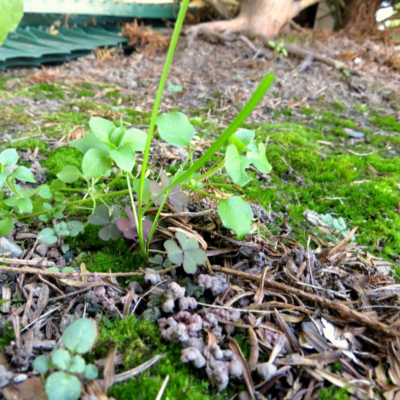
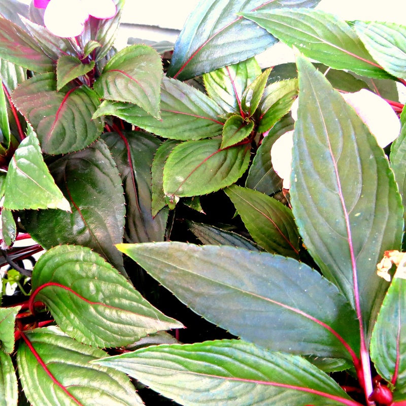
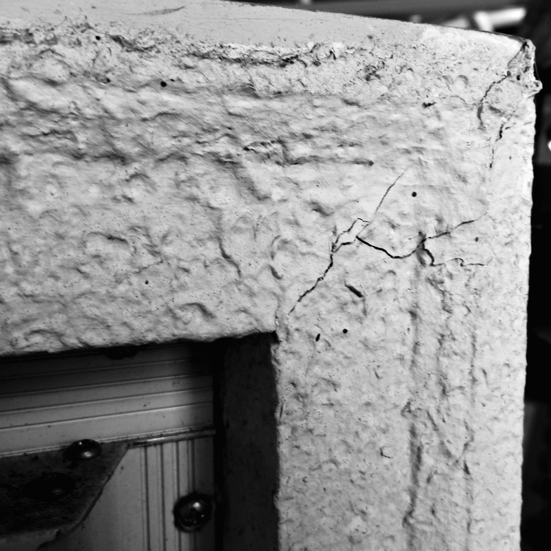
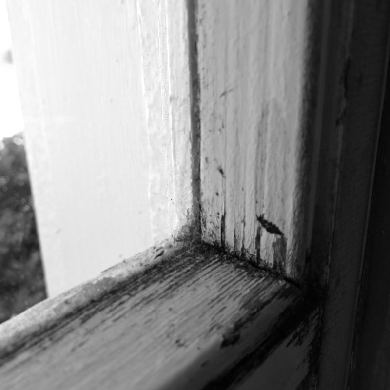
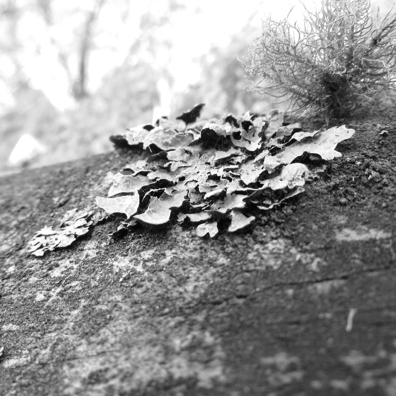
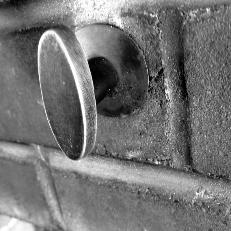
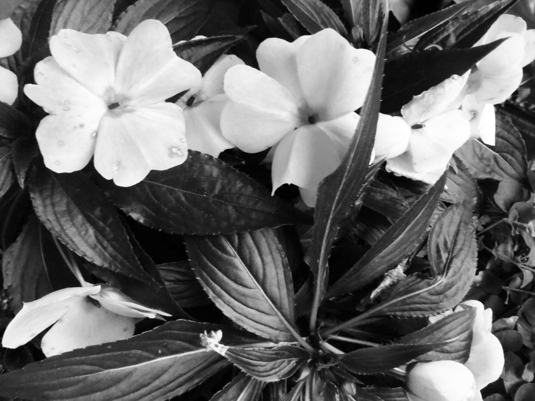
All of the photos above/below are examples of pattern and texture. I chose to shoot photos of a mixture of natural and manmade objects. For natural, I took photos of flowers, overlapping leaves, grass, eroding wood, and moss that I found in various places around my yard. For manmade, I took photos of a cracking plastered dresser, a windowsill, and a zoomed in image of a knob and bricks above a fireplace.
Most of these shots were shot very up close. I did this because I wanted the detailed textures to be the focus of the photo. It also allowed for the textures to really stand out, like the bumpiness of the plaster in the photo to the right, or the lines that make up the different leaves. Depending on what the object was changed the angle at which I took the photo. For the grass and upwards leaves (in photos 2 and 4 of the bottom row) I wanted the angle to be straight on to create a sense of depth. I also wanted the tops of the leaves to be seen without anything but the sky behind it, to allow for a focus on the shape and texture of the blades rather than having a busy background that distracts the eye.
For the most part all of my photos did fill the frame of the compositions The only exceptions are the 2 photos in the bottom row of the blades of grass/ leaves. I purposely wanted to get rid of objects in the top third to allow for a focus on only the blades. I really tried my best to consider the rule of thirds when composing my shots. I tried to divide the image up into 3 sections. I did this especially for photo 1 in the bottom row. When I was looking at the shot in person, I noticed 3 distinct sections that were present: a layer of twigs, a layer of grass/moss/clovers, and a layer of dirt. I purposely composed the picture to make sure that I divided the photo up into a third for each layer.
___________________________________________________________________
Assignment 3/4: Manipulating Shutter Speed To Capture Motion & Light

|
The top 4 photos and the bottom photos 3,4, and 6 were taken in school with the provided camera. All other photos were taken by myself outside of school with my own camera.
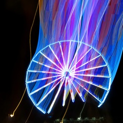
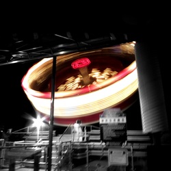
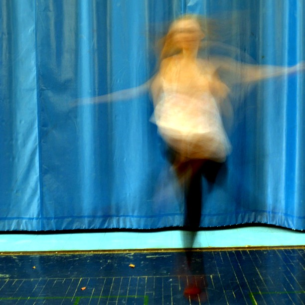
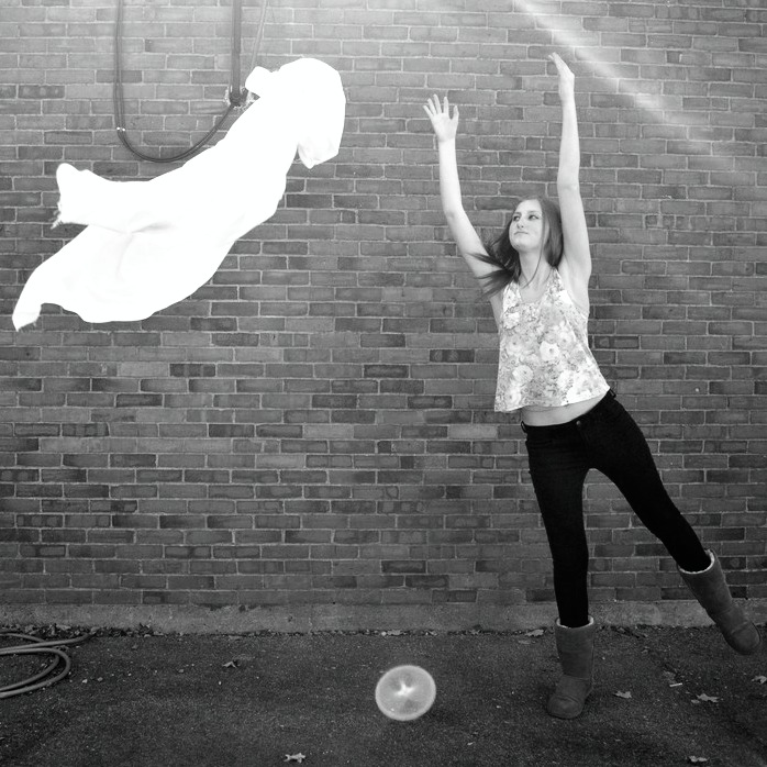
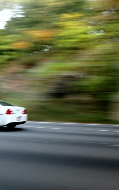
For motion, we had to take photos of frozen and blurred motion using various shutter speeds. In the bottom row, photo 4 was taken with a fast shutter speed to capture me and the sheet frozen in the air. For shutter speed we used about 1/800. For the action, I threw a sheet and jumped up as I threw it. The distance was far enough away that my whole body fit into the frame, but close enough that the shot was fully filled. The point of view was straight on. For composition, I wanted the sheet to be on one side, higher up, and me on the opposite side, lower to the ground, to really show was direction that I was throwing it in and the movement I was creating. In the rule of thirds, I wanted to separate me and the sheet in the top left third and the bottom right third so that the shot was filled. Shooting with the background of the brick wall also added texture that contrasted the smoothness of the sheet and my clothes. The black and white effect also added a ton of contrast between the grey background and the striking white on the air and my clothes. It draws your eyes right to the motion thats occurring. Also in the bottom row, photo 2 was taken with a slow shutter speed. I used a shutter speed of about 8 seconds to capture this photo. I used my shutter speed setting on my point and shoot to get this shot. The part of the image that shows blur is the ride that was moving as I took this shot. The ride was a spin ride that stood sideways in the air with the inside spinning in a circle. Because of the safety precautions at the theme park, I could not get as close to the ride as I wanted to to take this shot, so to help focus your attention on the ride I added a black and white effect to every part of the photo except the ride itself. I wasn't able to properly follow the rule of thirds because of my limited access to the shot, but I did try my best to center it so that it was the focus of attention, and I tried to work with the angle I had by adjusting it so that the 2 beams in the top right corner angled themselves towards the ride. |
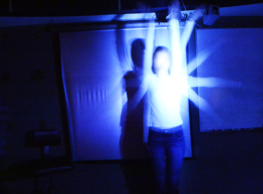
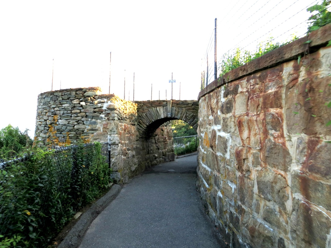
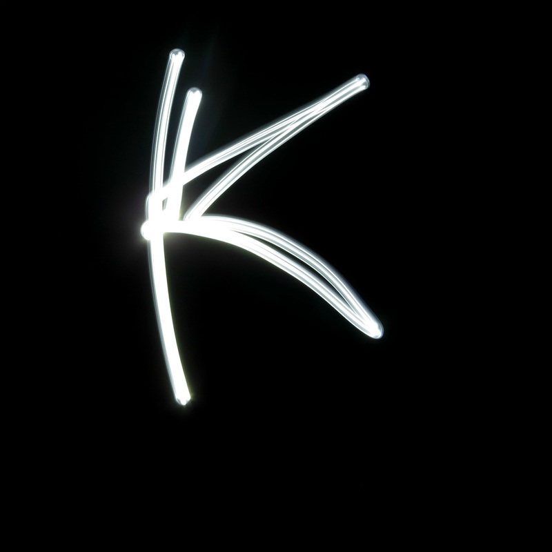
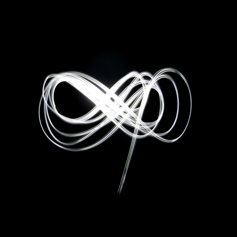
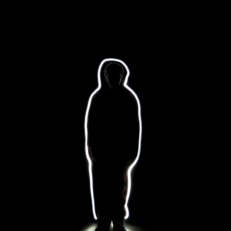
In the painting with light assignment, featured mostly in the top row with some in the middle on the left, we had to use a long shutter speed to capture light with a camera. My favorite photo that I took was photo 3 in the top row. The shutter speed was on about 16 - 20 seconds. To create this I used a tiny flashlight because I figured it would be easy to draw with and it was easy to control. To achieve this photo, I had my younger brother stand still as I drew with a flashlight around his silhouette. I think this photo has a very strong impact because its drawn with a strong white light that contrasts with the pitch black darkness of the background. I think a viewer would be interested looking at my photo because they'd immediately be able to tell its a persons silhouette but then you look closer and realize that you can somewhat see the person and it becomes a lot more interesting and complex the longer you look.
