
Alex Maclean Photograph Reflection
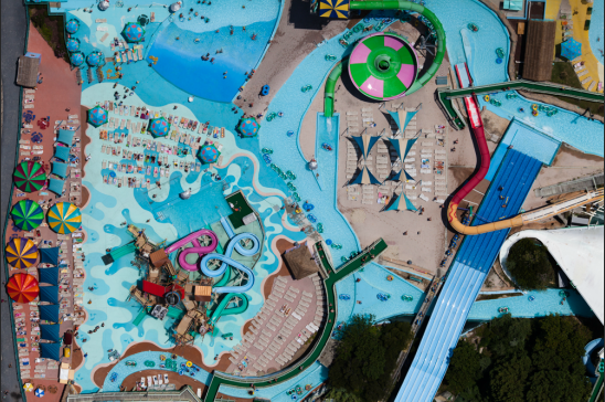
For this assignment we had to choose our favorite photo from Alex Maclean's website and reflect on it. I was drawn to this image because I thought it was really cool looking and it almost looks like more of a painting or a drawing rather than a real photo of a water park. It also had very bright colors and instantly I was drawn to it. The lighting in the photo is very bright, which emphasizes the colors of the water, the sides, and the umbrellas by the pool. It makes the colors a lot more vibrant and really adds interest to the photo. The light is probably coming from above: natural light from the sun. It falls evenly over the whole photo, which occurred because Maclean shot this photo from straight overhead and was shooting this in the same direction the sun was hitting it. The photo has some contrast between the dark green and the bright blue but other than that there really isn't much. There aren't a lot of whites or blacks in the photo, its mostly all blues and greens and colors that compliment each other. I think the exposure of the photo is good just how it is. Its not too underexposed to the point where the colors lose their vibrancy but its also not so overexposed that the photo takes on a whitish, faded tint. The photograph is in focus, which is really amazing considering how many little details there are and how high up he was when he took this photo. Everything is identifiable and nothing is blurred. I don't think the photographer really used shutter speed or depth of field for this because the angle he was taking it at made everything look completely flat, and I don't think depth could have been used in this.
This photo was taken from a straight above point of view looking down on the entire scene. The photo doesn't really have any balance: everything is kind of random and unrepetitive. The photo does meet the rule of thirds. In the bottom left there is one slide, another in the top right, and water going throughout the whole image. There is nothing that's really entirely centered and there is a main piece of the photo in both the bottom and the top thirds on the left and right side of the photo. I don't think there is a clear focal point. I think the photo was meant to be a photo of everything in the water park and not just one piece of it. It's a very distracting photo and I think Maclean would have used blurring if he wanted to focus on just one part of the park. The photograph is horizontal and I think this is effective because it shows the whole park and not just a sliver of it. It also allows for multiple slides to be shown. The water also guides from the top left down to the bottom right and if the photo was vertical the water wouldn't have as effectively guided the eye throughout the photo. The photographer didn't really frame the photo in my opinion, and also didn't really try to create depth. The photo is so flat and I think thats what he was going for with it. In the piece I believe the water serves as leading lines that guide the eye throughout the piece. It brings your eye from one water slide to another and throughout the entire photo. The reason it works as a guide is because of its bright contrasting blue color.
The photo is an original and creative composition. Any photo of a water park could look pretty similar, but Maclean made it interesting and creative by taking the shot from above and distorting the regular appearance of water parks that we see in person when we are actually there. It's really interesting to see how just taking a photo from a different point of view can change the familiarity of the subject. The point of view is very unusual because not everyone can get a shot from that kind of angle. You have to be up in the air high above the subject matter to get that kind of view. The photograph in my opinion provides a really happy, playful, summery mood. This mood was created through all the vibrant colors in the photo and the subject material that it was. When you think of water parks you think of summer and being a kid and just playing. I think the most successful thing about this photo was the angle that it was taken at and the way that Maclean captured something so familiar to people in such a different appearance than you would expect a water park to have. It brings a whole new point of view to the subject and makes it so much more interesting than a plain old water park photo normally is. I think the only thing the photographer could improve is the cropping of the photo. I think the bottom could have been cropped up a little bit more because there is a lot of that dark green in the bottom corner and I don't believe the photo needs that much of it to achieve contrast.
